Not too big to admit mistakes.
In the interior of the completely new Volkswagen ID Polo, many essential buttons are making a comeback. In Wolfsburg, they appear not to be too big to rectify the mistakes made five years ago, when the brand sidelined all physical buttons as a cost-saving measure. Volkswagen then had us swiping and wiping on sliders and touchscreens, which in practice turned out less well than on the drawing board.
Last month, we drove a camouflaged prototype of the Volkswagen ID Polo, the fully electric compact hatchback that will be in showrooms after the summer. During that first introduction, the dashboard was hidden under a canvas cover with several holes for the most essential controls, so we could still take it for a spin. Now, in Wolfsburg, they are literally pulling the cover off the dashboard, and we can show you an undisguised interior.
In the Volkswagen ID Polo, ease of use triumphs over ultimate cost savings.
Learned from mistakes: accountants to the background
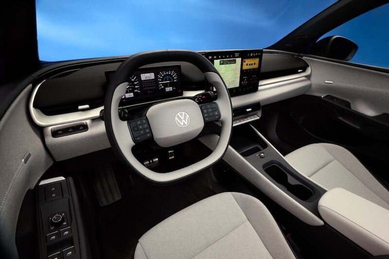
The design of the ID Polo dashboard is completely new and, according to Volkswagen, shows the direction for all subsequent ID models. VW openly admits that it has listened to criticism regarding the operation of the first generation ID models and has learned from the mistakes made. Not only does the new setup herald the return of physical buttons, but it also marks the debut of a new software generation. In 2020, with the ID3, we encountered a dashboard where, due to cost savings, the number of physical buttons had been reduced to an absolute minimum; for almost everything, you relied on the multimedia screen. However, that demands too much attention and distracts from traffic. Reversing the cost reduction of that time should contribute to a more intuitive and thus safer operation.
With the Volkswagen ID3, operation suffers from cost-cutting.
Volkswagen ID Polo has real buttons, and many of them
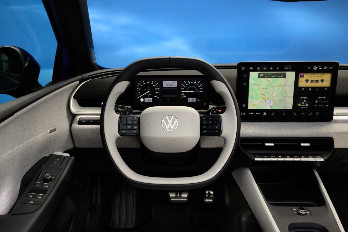
With the ID Polo, the dashboard design is horizontally oriented and still quite minimalist: sleek and business-like, but with greater ease of use than in previous electric VWs. What immediately stands out upon entering is that the materials used feel much more pleasant than they did in the ID3. Furthermore, below the ID Polo’s infotainment screen, a row of physical buttons catches the eye for operating the air conditioning and hazard lights. For those afraid that, like in the ID7, you can only direct the ventilation grilles via the touchscreen, we can reassure you: the ID Polo does not have that solution for a non-existent problem. The air vents can simply be operated manually. And to adjust the audio volume, you no longer have to swipe over a slider, but instead have a real rotary knob again, for quick and accurate adjustments to the sound level. All these buttons, keys, and switches have a ribbed surface that provides good grip. We also find this on the door release handle (which works purely mechanically and not via a digital button). For audio and cruise control operations on the steering wheel, you don’t have touch surfaces but rather physical buttons. Incidentally, there are also a few blank areas between those buttons on the steering wheel. These are not for options you haven’t paid for, but rather operating space for future functions. And as if that weren’t enough, on the driver’s door, you once again have four buttons for operating the side windows instead of just two. All of this contributes to being able to operate the car much more intuitively than was recently the case with Volkswagen.
No more swiping and sliding: the physical rotary knob is back to turn the radio up or down. Bravo!
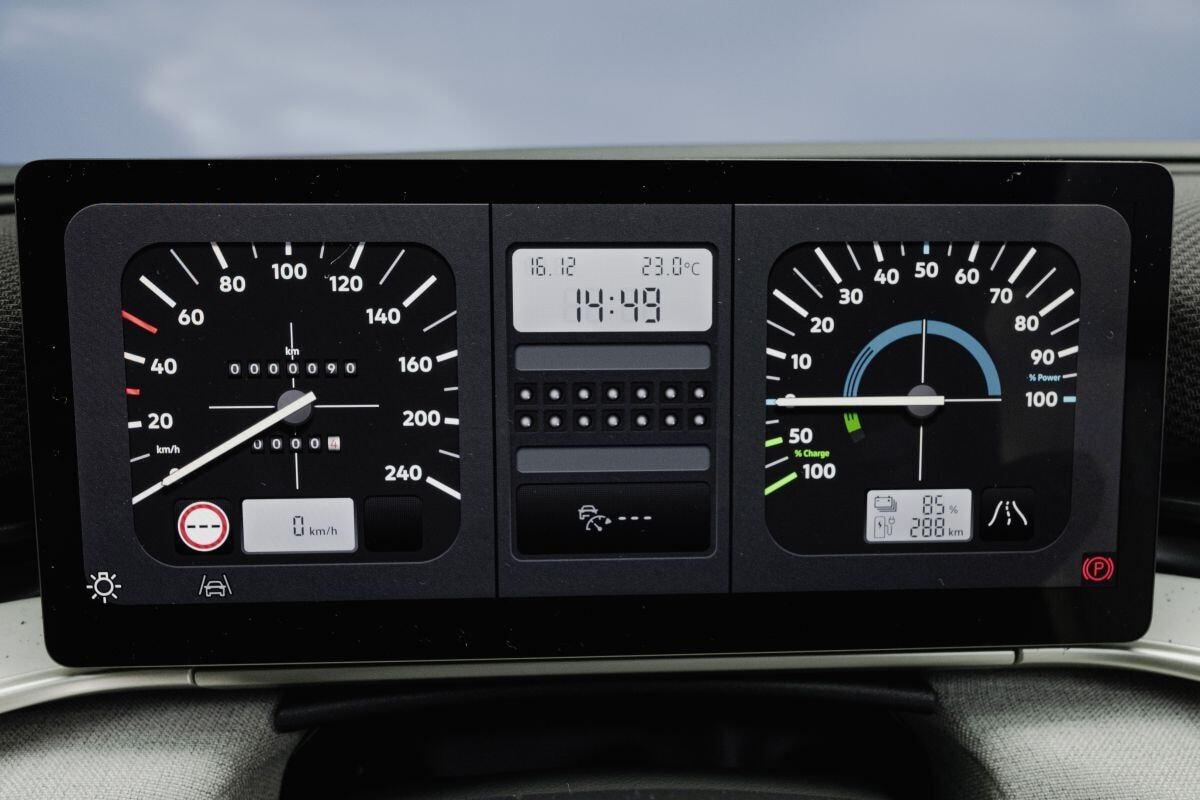
Nice retro: gauges from the Golf I
With the ID Polo, there isn’t a small display on top of the steering column containing only the most essential information, but rather a full-fledged digital instrument cluster (10.25 inches) in the dashboard. Centrally, you have a 13-inch touchscreen. The layout of the multimedia system, as well as its graphic design, strongly resembles what we already know from Volkswagen. This requires little getting used to. You can effortlessly retrieve the desired information on both the instrument cluster and the infotainment screen. For those whose yearning for retro goes further than the return of a set of physical buttons: with the push of a button, the instrument cluster adopts the layout of that from the first generation of the Volkswagen Golf, including an analog-looking speedometer and a power meter that resembles the tachometer of that era. It is, by the way, the instrument cluster from 1982, so from after the facelift. This was chosen for the simple reason that this version already had a small LCD clock, which can now be used for information that cannot be displayed with needles on a dial. Meanwhile, the multimedia screen is also not forgotten: by giving it a retro look, the media player looks like a cassette tape, and the battery gauge looks like it did back then.
An instrument cluster with apparently two classic analog gauges; Mercedes has been doing that for years.